Expert App
Project Overview
Expert is a mobile app that connects users with experienced professionals in virtually any field. Expert uses a three-step approach to easily connect users with an expert best suited for their needs. Whether it's for personal or professional growth, Expert helps you save time and energy, and focus on what truly matters in life.
Timeline: October 2022-June 2023. My Roles: UX Researcher, IA Architecture, UI&UX Designer. Tools: Figma, Canva, Usability Hub, Lucid Chart, Google Workspace. Project Type: Student Project for Career Foundry’s UX Design program.
The Problem
Finding answers to our questions online can be frustrating, time-consuming, and unreliable. Users need a way to quickly connect with trustworthy experts to answer their questions so that they can spend time on the things that matter.
The Solution
The Expert app will create a platform for users to be connected with trustworthy experts to help solve their problems and questions. The streamlined process of searching, selecting, and booking will reduce frustration and free up time otherwise spent browsing the internet.
Design Process
When beginning a project, I maintain a 6-stage Design Thinking process proposed by Nielsen Norman Group.
Competitive Analysis
In order to elevate Expert above the competition, I conducted a thorough analysis of the current market offerings to pinpoint areas that are working, as well as where improvements could be made.
I decided to focus my study on two successful platforms currently available for answering questions, Just Answer, and Quora.
User Interviews
After exploring current market models, I conducted user interviews with 3 participants to gain a more personal insight into the attitudes and behaviors users have when faced with questions. When drafting my script I kept the following goals in mind:
Goals
Identify current methods users go about reaching expert help and advice.
What pain points/restrictions do the current market present?
Identify features/abilities that would encourage or attract users to use the Expert app.
Results
100% of participants spend excessive time researching their problems.
Participants stated they often find conflicting information on their topic, and that sometimes their questions have never been asked.
All participants cannot currently trust the sources for their answers.
User Persona
I then created a user persona to visually represents the needs and desires of the users based on my research.
Referring to my persona throughout the entire design process ensured I would maintain empathy at the core of my design decisions.
User Flows
I then created user flows for essential features that would help my persona accomplish their goals.
Site Map
Using the user flows, I was able to create an initial sitemap to establish the hierarchy of Expert’s different pages.
To ensure the sitemap is understood to users, I conducted a closed cart sort with 8 participants.
Using this information, I was able to refine my sitemap so that it may be better understood to users.
Sketching
Once I had established a clear framework for Expert's layout, I then sketched out my persona's user flows.
Low-Fidelity Prototype
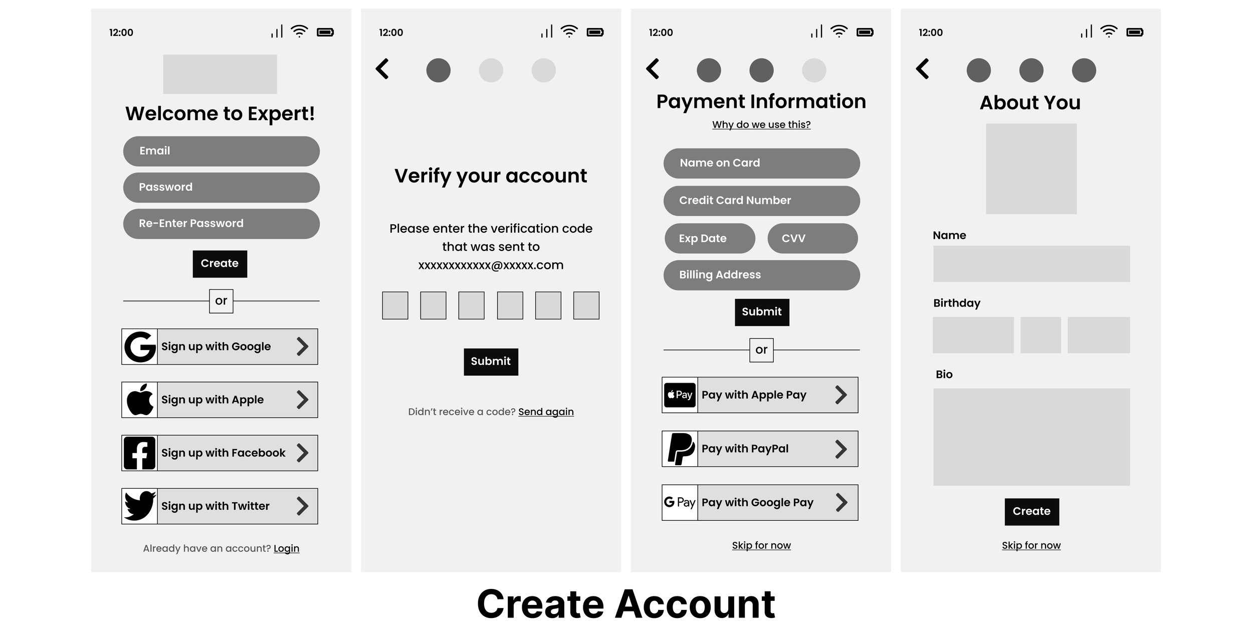
Once I had a clear vision of my screen layouts, I used Figma to develop a low-fidelity prototype of the user flows.
Usability Testing
To assess the usability of my prototype, I then conducted six tests both in-person and remotely. After gathering the results, I used an affinity map and rainbow spreadsheet to prioritize the areas that require improvement.
Design System
I then created a design system to ensure consistency throughout the app for myself, as well as any collaborators that would work on future iterations.
Design Collaboration
Once I had implemented the design system, I gathered feedback from 8 peers in order to identify opportunities and make further iterations.
Issue 1
Progress indicators and the back button were too big and distracting from the onboarding text.
Solution
I reduced the sizes of the back button and progress indicators and created space to make the onboarding text the primary focus of the page.
I additionally updated the CTA button to improve accessibility.
Issue 2
Users found the search area on the home button to be crammed and difficult to access, as well as confusion about the logo.
Solution
I decided to remove the logo to allow for more space in the search area and give the page more balance.
I additionally added icons for profiles that are currently trending or highly rated.
Issue 3
Users felt that the Confirm Booking screen displayed too much information that was distracting, and the Audio/Video buttons were hard to read.
Solution
I redesigned the page to remove unnecessary information, as well as to create dropdown lists for meeting preferences.
I additionally grouped information together to add space and create emphasis on the page’s CTA buttons.
Interactive Prototype
Check out the latest iteration below!
Reflection
Creating Expert was an incredibly rewarding journey for being my first case study in the world of UX research and design. Through immersive research and analysis, I gained valuable insights into users’ needs and goals. Crafting user personas, designing flows, and receiving feedback consistently throughout the entire project fostered a user-centric approach, ensuring the proposed solutions aligned with my persona as well as other users’ expectations. This experience reaffirmed my passion for UX design, emphasizing the significance of creating consistent and meaningful experiences for users.


